Knowledge Hub • Seasonality • Commodity Research
How Is Market Seasonality Calculated?
Understanding seasonal charts, normalized price paths and the methodology behind the COT-Trader Seasonality Indicator.
Reading time: ~12–16 minutes | Site: cot-trader.com
Introduction
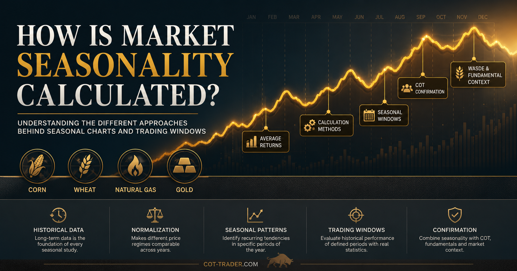
Seasonality is one of the most widely used concepts in commodity and financial market analysis. Traders frequently encounter seasonal charts showing recurring patterns in markets such as corn, wheat, soybeans, natural gas, gold, crude oil or stock indices.
However, one important question is often overlooked:
How is seasonality actually calculated?
The answer is more important than it may first appear. A seasonal chart is not simply “the market’s seasonal pattern”. It is the result of a specific calculation method, a defined lookback period, data assumptions and normalization choices.
Two seasonal charts for the same market can therefore look different, even if both are based on valid historical data.
This article explains the most common approaches, their strengths and weaknesses, and the transparent methodology I use in the COT-Trader Seasonality Indicator for TradingView.
What Is Market Seasonality?
Market seasonality describes recurring price tendencies that appear during specific periods of the year. These tendencies may be linked to production cycles, demand patterns, weather, storage, tax effects, institutional flows or broader calendar effects.
Examples include:
- corn, soybean and wheat markets reacting to planting and harvest cycles,
- natural gas responding to seasonal heating and cooling demand,
- precious metals showing recurring strength or weakness during certain calendar periods,
- equity markets displaying well-known calendar effects such as year-end strength.
Seasonality does not predict the future. It describes how a market has behaved historically during similar calendar periods.
The objective is to identify tendencies, not certainties.
Why Seasonal Charts Can Look Different
Many traders assume that seasonality is calculated in the same way everywhere. In reality, every seasonal chart depends on several methodological decisions.
Important questions include:
- Which historical period is used?
- Are absolute prices or relative price changes analyzed?
- Is the data normalized?
- Are arithmetic averages, geometric averages or medians used?
- How are missing trading days handled?
- How are futures contract rolls treated?
- Are seasonal curves or specific trading windows evaluated?
- Are transaction costs, slippage or drawdowns included?
Different answers to these questions can produce different seasonal charts. This does not automatically mean that one chart is right and another is wrong. More often, they are simply answering different research questions.
Method 1: Average Historical Prices
The simplest approach is to average historical prices for each calendar day or week.
For example, one could take the price of corn on each trading day in March over the past 10 years and calculate an average price path.
Problem
This method is usually not ideal for markets with large long-term price changes.
For example, averaging a corn price of 250 cents with a corn price of 700 cents can create a misleading result. A 30-point move at 250 is very different from a 30-point move at 700 when measured in percentage terms.
For that reason, raw average price charts can be distorted when the market has traded through very different price regimes.
Advantages
- easy to calculate,
- easy to understand,
- useful for a quick visual impression.
Limitations
- mixes different absolute price regimes,
- can be misleading in long historical datasets,
- is usually less suitable for futures and commodities.
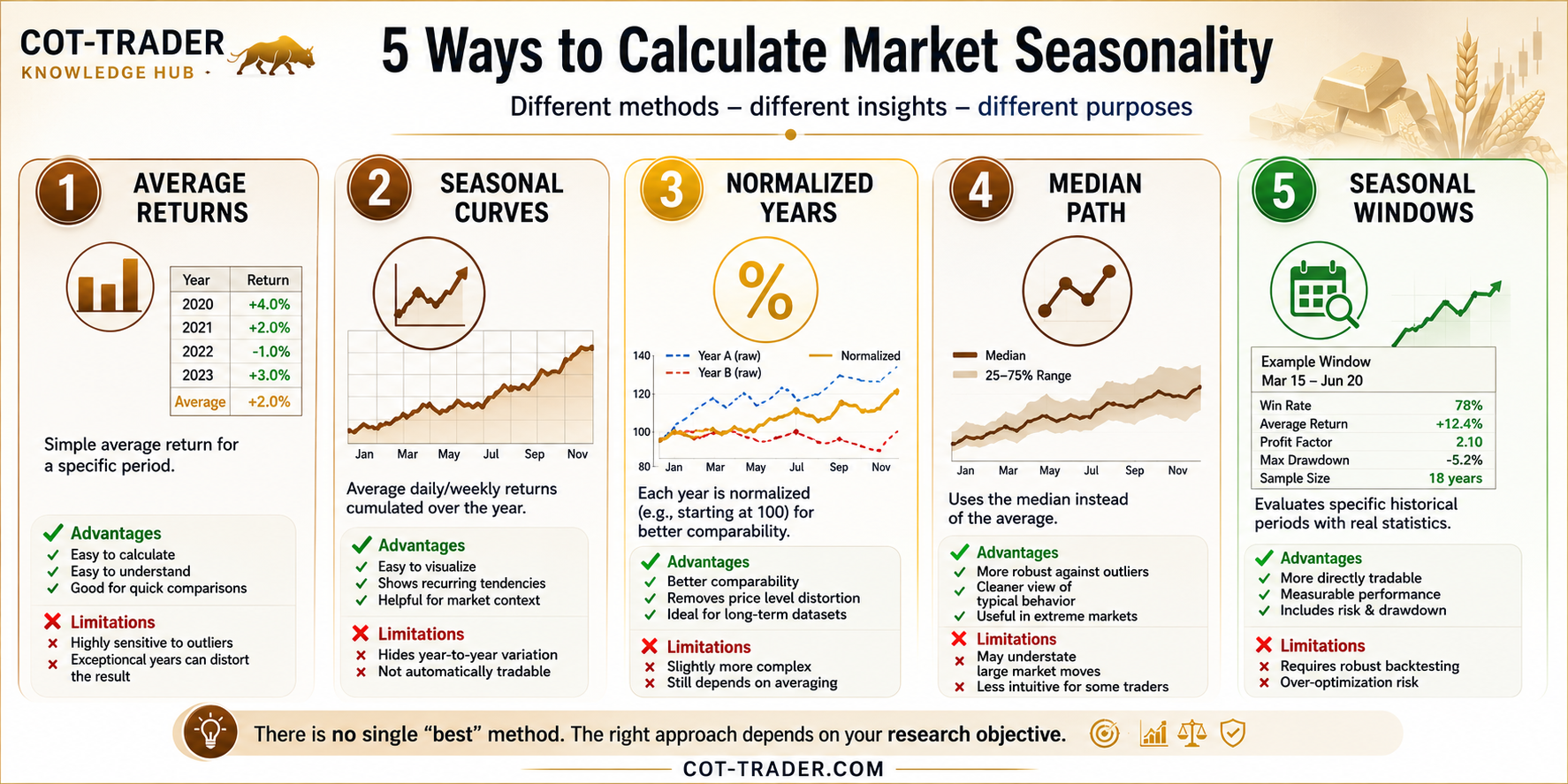
Method 2: Average Historical Returns
Another common approach calculates the average return for a specific seasonal period.
| Year | Return |
|---|---|
| 2020 | +4.0% |
| 2021 | +2.0% |
| 2022 | -1.0% |
| 2023 | +3.0% |
The arithmetic average return would be:
(+4.0 + 2.0 - 1.0 + 3.0) / 4 = +2.0%
Advantages
- simple and intuitive,
- useful for comparing defined periods,
- helpful for quick seasonal window checks.
Limitations
- highly sensitive to outliers,
- does not show the path within the year,
- provides limited information about drawdown or tradability.
Method 3: Cumulative Seasonal Return Curves
This is one of the most common approaches used for visual seasonal charts.
The process typically works as follows:
- Calculate daily or weekly returns for each historical year.
- Calculate the average return for each calendar day or week.
- Cumulate those average returns over the calendar year.
The result is a continuous seasonal curve showing the average historical path of the market throughout the year.
Advantages
- easy to visualize,
- useful for identifying recurring tendencies,
- helps traders understand seasonal context.
Limitations
- can hide significant year-to-year variation,
- strong individual years may influence the curve,
- does not automatically identify tradable opportunities.
A visually attractive seasonal chart is not automatically a profitable trading strategy.
Method 4: Normalized Historical Years
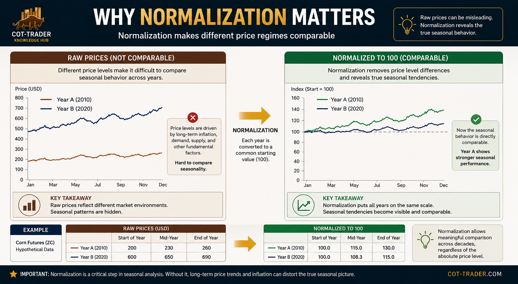
Many seasonal studies normalize historical data before averaging. The goal is to make different years comparable regardless of their absolute price levels.
For example, corn trading at 250 cents in one decade and 700 cents in another decade should not be averaged directly as raw prices if the objective is to compare seasonal behavior.
A common solution is to convert each historical year to a common starting value, such as 100.
| Date | Raw Price | Normalized Value |
|---|---|---|
| Start of Year | 250 | 100.0 |
| Mid-Year | 275 | 110.0 |
| End of Year | 260 | 104.0 |
This allows historical years to be compared on a relative basis rather than on an absolute price basis.
Advantages
- improves comparability across different price regimes,
- reduces distortions caused by changing price levels,
- works well for commodities and futures markets.
Limitations
- depends on the chosen normalization point,
- still requires a clear averaging method,
- does not remove all regime or outlier effects.
Method 5: Median-Based Seasonality
Instead of using the average, some analysts use the median historical path or median return. The median is less sensitive to extreme outliers than the arithmetic average.
This can be useful when a small number of exceptional years would otherwise dominate the seasonal curve.
Advantages
- more robust against extreme years,
- can provide a cleaner view of typical behavior,
- useful when historical data contains major shocks.
Limitations
- may understate large but relevant market moves,
- less intuitive for some traders,
- does not directly measure trading risk.
The COT-Trader Method: Indexed Geometric Seasonal Path
For the COT-Trader Seasonality Indicator, I use a method I call the Indexed Geometric Seasonal Path.
The objective is to create a transparent seasonal curve that compares relative price development across different historical price levels without simply averaging raw prices.
Calculation Logic
The method works as follows:
- Each historical year is indexed to a base value of 100 at its first available trading day.
- Each following trading day is expressed as a relative factor versus that year’s starting value.
- For each calendar day, the geometric mean of the indexed historical year factors is calculated.
- The result is plotted as a seasonal curve starting around the base value of 100.
In simplified form:
Indexed Value = 100 × Current Close / First Close of the YearFor the seasonal average, the indicator uses a geometric approach rather than simply averaging indexed values arithmetically.
This is important because market development is multiplicative. A 10% gain followed by a 10% loss does not bring a market back to its original level:
100 × 1.10 × 0.90 = 99For this reason, a geometric approach is often more appropriate when working with relative price factors.
Why I Use This Method
This approach offers a practical balance between mathematical transparency and TradingView implementation constraints.
It avoids the main weakness of simple average price charts: historical years with very different price levels are not mixed directly.
At the same time, it works well within TradingView’s bar-based environment, where futures contract rolls, missing trading days, weekends and holidays need to be handled pragmatically.
The goal is not to build a perfect academic seasonal model. The goal is to create a robust, transparent and visually useful research tool for real market analysis.
What the COT-Trader Seasonality Indicator Shows
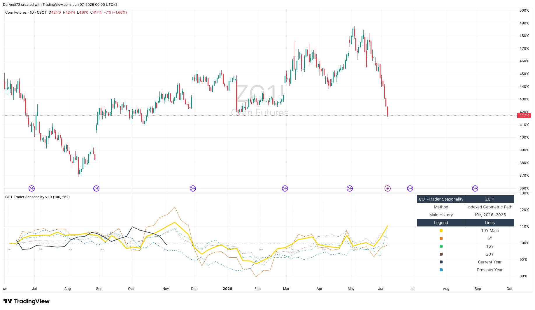
The TradingView indicator displays several seasonal reference curves:
| Line | Meaning |
|---|---|
| 10Y Main Curve | The main seasonal curve based on the last 10 completed years. |
| 5Y Curve | A shorter-term seasonal comparison curve. |
| 15Y Curve | A longer-term seasonal comparison curve. |
| 20Y Curve | A broader historical seasonal comparison curve, if sufficient data is available. |
| Current Year | The current year indexed to 100 and shown as a YTD path. |
| Previous Year | The previous year indexed to 100 for visual comparison. |
The current year line stops at the latest available data point. It is not artificially extended into the future.
The month labels shown in the indicator are a synthetic seasonal month scale. They are designed to help interpret the seasonal curve from January to December. They are not the same as TradingView’s real chart time axis.
Example: Corn Futures Seasonality
Corn is a useful example because the market is strongly influenced by agricultural cycles, planting progress, weather risk, crop development, harvest expectations and changing supply-demand conditions.
The chart below is an illustrative seasonal research example for Corn Futures. It shows how seasonal analysis can be connected with broader market context rather than treated as a standalone signal.
This type of analysis helps answer questions such as:
- Is the current year behaving similarly to the historical seasonal tendency?
- Does the short-term seasonal curve differ from the longer-term historical view?
- Are there periods where multiple seasonal curves point in the same direction?
- Is the current year an outlier compared with historical indexed paths?
- Does the seasonal picture align with COT positioning, fundamentals or weather risk?
The indicator itself does not generate trading signals. It is designed as a visual research tool.
What the Indicator Does Not Do
It is equally important to define what the indicator does not do.
- It does not predict future prices.
- It does not generate buy or sell signals.
- It does not automatically identify the best seasonal trading window.
- It does not include stop-loss, take-profit or position sizing logic.
- It does not replace fundamental, positioning or risk analysis.
This is intentional.
The purpose of the indicator is to visualize seasonal tendencies clearly. Specific trading windows should be evaluated separately with proper backtesting and risk analysis.
Seasonal Window Analysis
Seasonal curves answer the question:
How does the market typically behave during the calendar year?
Seasonal window analysis asks a different question:
What would have happened if a specific seasonal period had been traded historically?
For example, one might test a window such as March 15 to June 20 with a long or short bias.
| Seasonal Window | Direction | Win Rate | Average Return | Sample Size |
|---|---|---|---|---|
| March 15 – June 20 | Long | 78% | +12.4% | 18 years |
Such analysis can include:
- win rate,
- average return,
- profit factor,
- best and worst historical year,
- maximum drawdown,
- sample size,
- risk-reward characteristics.
I intentionally keep this logic separate from the visual seasonality indicator. A dedicated COT-Trader Seasonal Backtest Strategy is better suited for this type of analysis.
Why Separation Matters
A seasonal curve and a seasonal trading strategy are not the same thing.
A seasonal curve is descriptive. It shows a historical tendency.
A seasonal strategy is testable. It requires clear rules for entry, exit, direction, risk, costs and position sizing.
Mixing both concepts in one chart can be misleading. A clean seasonal indicator should first help the trader understand the historical tendency. A separate backtest strategy can then evaluate whether a specific trading window would have been tradable.
The COT-Trader Seasonal Research Framework
Transparency is a core principle behind COT-Trader.
As a private trader and market researcher, I do not want to treat seasonality as a black box. My goal is to make the assumptions behind seasonal analysis visible and to evaluate seasonal patterns in a structured, measurable way.
The COT-Trader framework does not rely on a single visual curve or isolated seasonal pattern. Instead, I use seasonality as one part of a broader research process.
Step 1 – Historical Data Review
Daily market data is reviewed over a defined historical period. For futures markets, contract structure, roll effects and data continuity must be considered carefully.
Step 2 – Data Normalization
Historical years are indexed to improve comparability and reduce distortions caused by changing price levels.
Step 3 – Seasonal Pattern Visualization
Seasonal tendencies are visualized using indexed historical paths. The objective is to identify recurring periods of strength or weakness, not to assume that history will repeat exactly.
Step 4 – Seasonal Window Evaluation
Potential trading windows should be evaluated separately using measurable statistics such as win rate, average return, profit factor, sample size and drawdown characteristics.
Step 5 – Additional Market Confirmation
Seasonality is not used in isolation. Whenever possible, seasonal tendencies are evaluated alongside additional market information such as:
- Commitment of Traders (COT) positioning,
- open interest developments,
- WASDE reports and agricultural fundamentals,
- broader commodity market context,
- volatility and risk conditions.
The objective is not to predict markets with certainty. The objective is to identify historically recurring tendencies that may become more relevant when supported by multiple independent factors.
Key Takeaway
Seasonality is a valuable research tool, but it is often misunderstood.
Different calculation methods produce different results because they answer different questions. Rather than searching for a single perfect seasonal chart, traders should focus on understanding:
- how the data was calculated,
- which assumptions were made,
- which limitations exist,
- whether the methodology fits the research objective.
The COT-Trader Seasonality Indicator uses an indexed geometric approach to compare relative seasonal price development across different historical price regimes.
It is not a prediction tool. It is a transparent visual framework for seasonal market research.
A seasonal chart is only as useful as the methodology behind it.
Sources and Further Reading
- My own Seasonal Script based on TradingView PineScript
- TradingView Help Center – Seasonality charts and Pine Script documentation
- CME Group – Agricultural futures and seasonal market factors
- SeasonalCharts – Market seasonality concepts
- Seasonax – Seasonality and seasonal analysis
- General time series analysis literature on seasonality, normalization and decomposition methods
- Philipp Müller / VTAD – Über die Konstruktion mathematisch korrekter Seasonal Charts und deren Analyse
Disclaimer
Past performance does not guarantee future results. Seasonal patterns represent historical tendencies and should not be interpreted as investment advice or guarantees of future market behavior. Trading futures, CFDs and other leveraged products involves substantial risk.